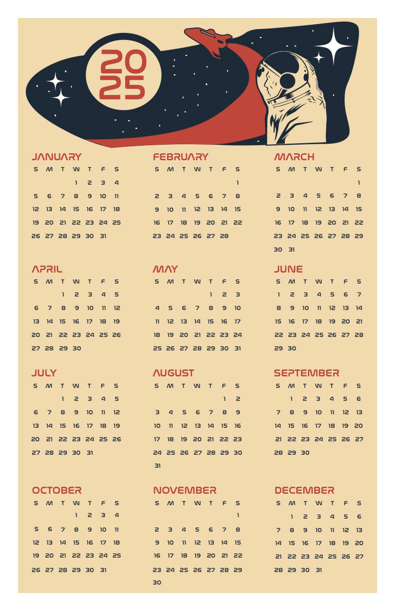
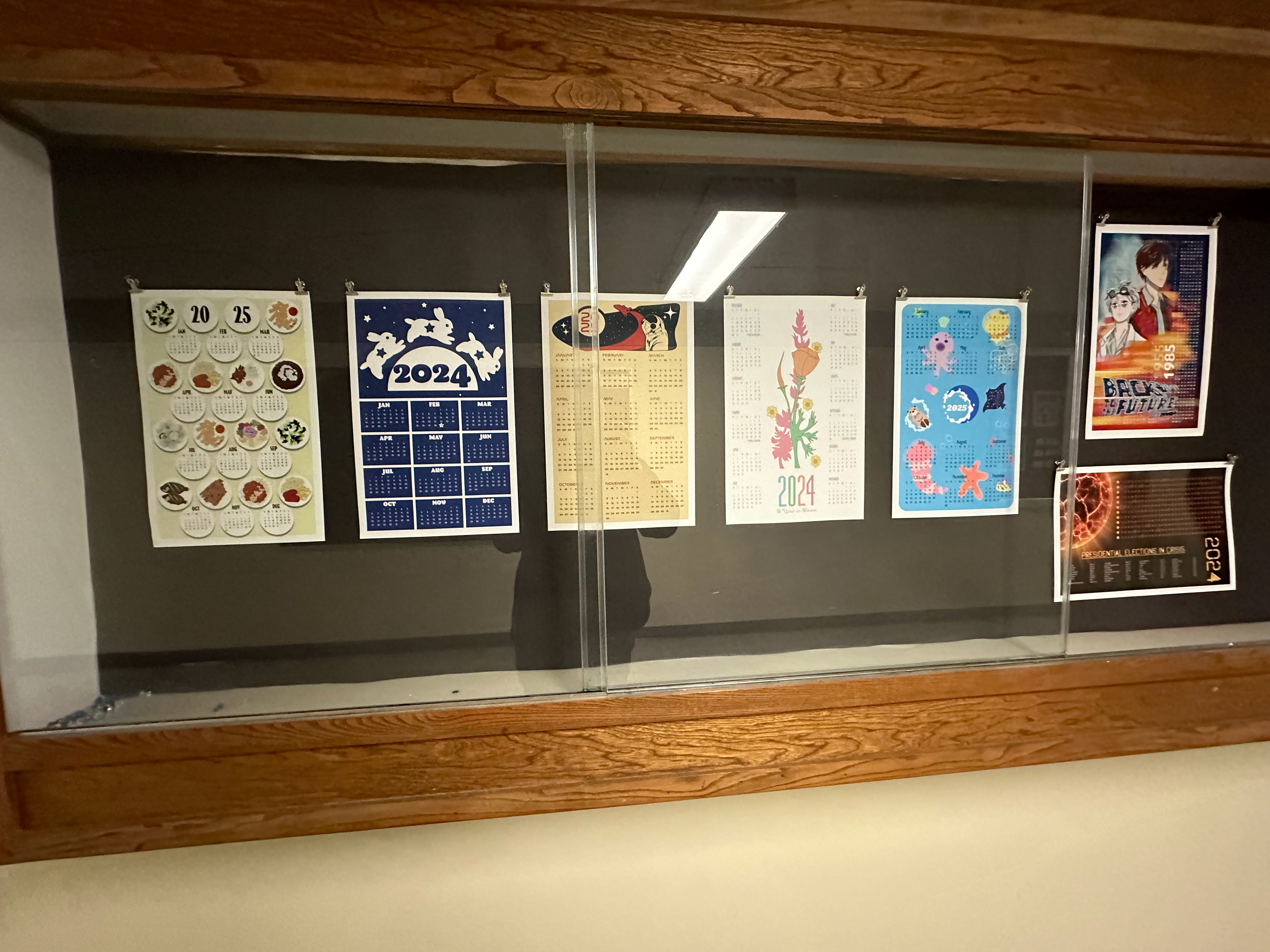
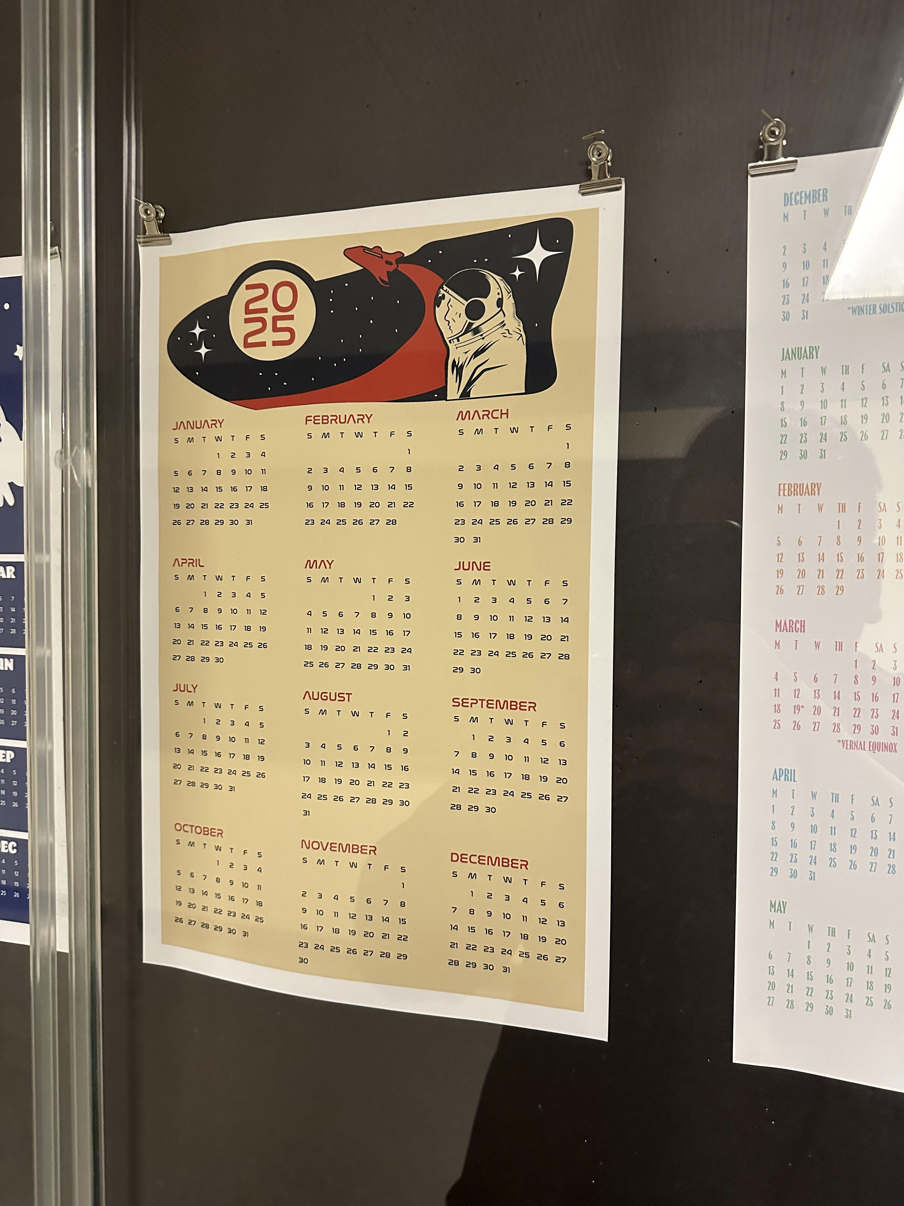
In my Typography I course, we were tasked with designing a calendar and accompanying postcard based on a chosen typeface and a cohesive design theme. The purpose was to explore typeface application and multi-page layout design.
The final calendar embraced a retro space theme, with graphics that referenced vintage space imagery. The palette included beige, blue, and red tones commonly seen in mid-20th-century
postcards, creating both a nostalgic and futuristic aesthetic. The calendar maintained visual consistency across months, balancing typography and illustration effectively.
postcards, creating both a nostalgic and futuristic aesthetic. The calendar maintained visual consistency across months, balancing typography and illustration effectively.
This project was unique in its ability to combine conceptual storytelling with functional design. It reinforced my understanding of typography as a design tool and the technical considerations required in print production. The retro-futuristic theme also allowed me to experiment with blending historical references with contemporary aesthetics, deepening my versatility as a designer.
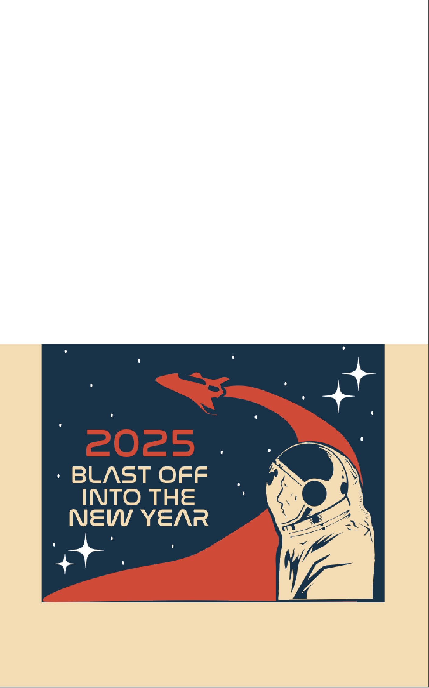
Postcard
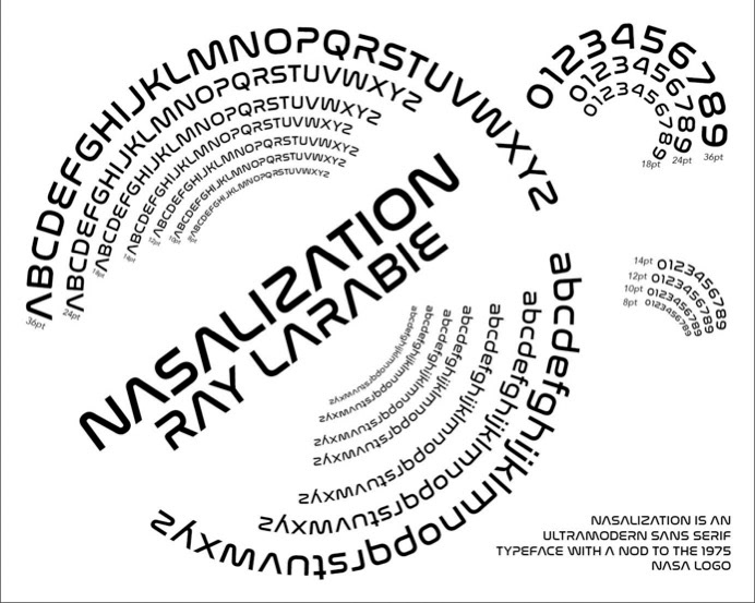
'Nasalization' Typeface Specimen Chart
Tools Used