‘Peak and Brew Cafe’ is my senior capstone project, which reflects the skills I have learned throughout my undergraduate graphic design career at CSU East Bay. My project is about creating a brand for an upcoming artisan cafe. The artisan cafe is called ‘Peak & Brew’, which is an outdoor/nature-inspired cafe where it can be a hub for students to study and people to hang out. The cafe specializes in Vietnamese coffee, milk teas, and fruit teas.
Logo Design
The beginning of senior project, I started with creating a logo design for Peak & Brew. My initial thought process was first to include mountains, nature and topography in my logo. I did my research through Pinterest, Behance and Google for inspiration. I started with focusing on mountains since the word “Peak” was the main focus. I continued playing out with the keywords “Peak” and “Brew” so I played with a coffee mug as well. After doing some sketches, I was more comfortable designing digitally. I used Illustrator and started with creating the logos I sketched and created more logos on Illustrator playing with typography as well.
I had three different logos I was confident in and had a few of my peers give their feedback. A lot of the positive feedback went to the second logo I had which became the final logo. This logo had the Adobe Font called Cubano and a mountain that I created on Illustrator. The colors I chose were an olive green and light brown. Overall, I spend about two hours creating the logo design and throughout the first two weeks of the project I made small modifications by cleaning it up.
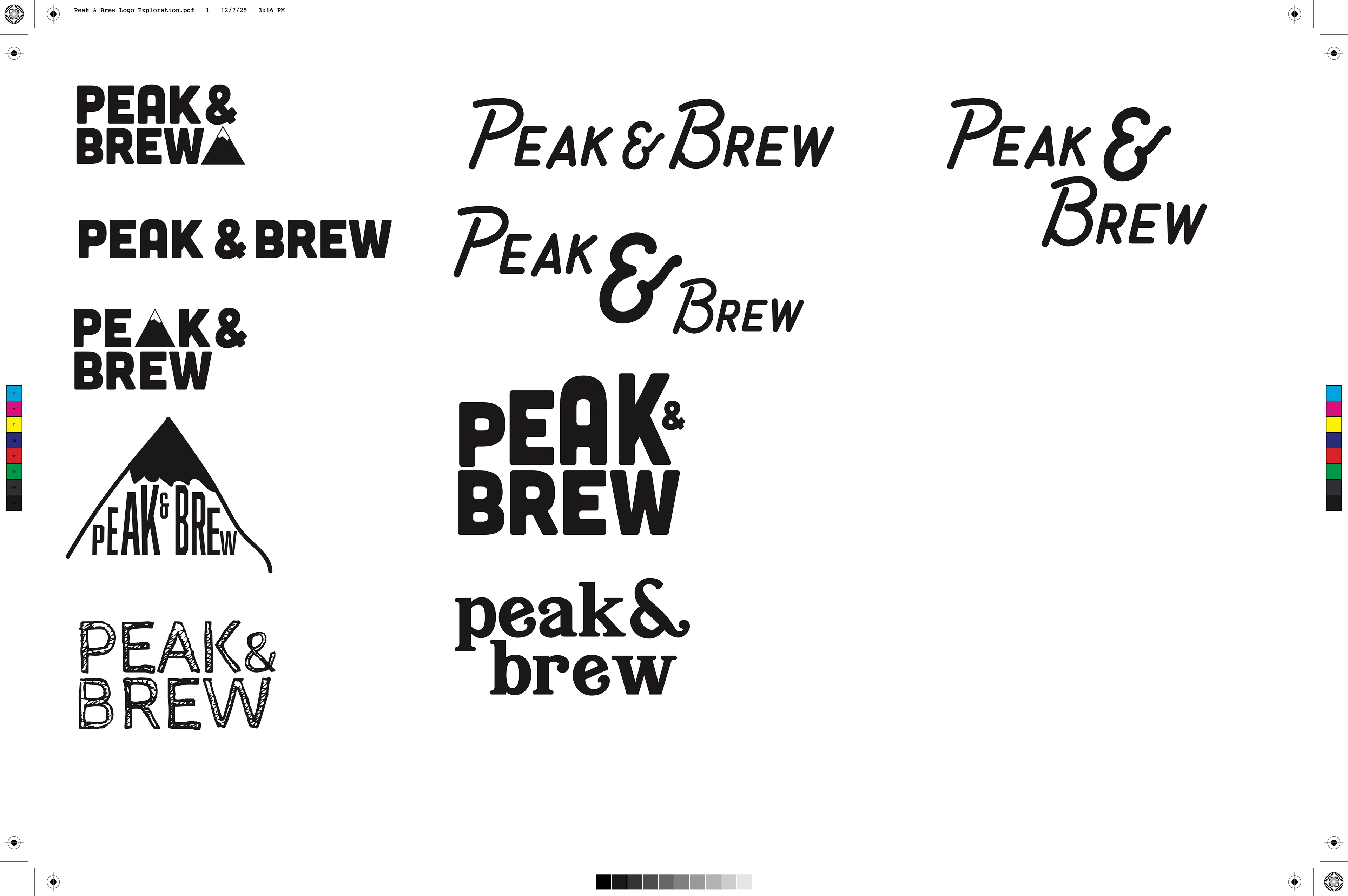
Logo Exploration
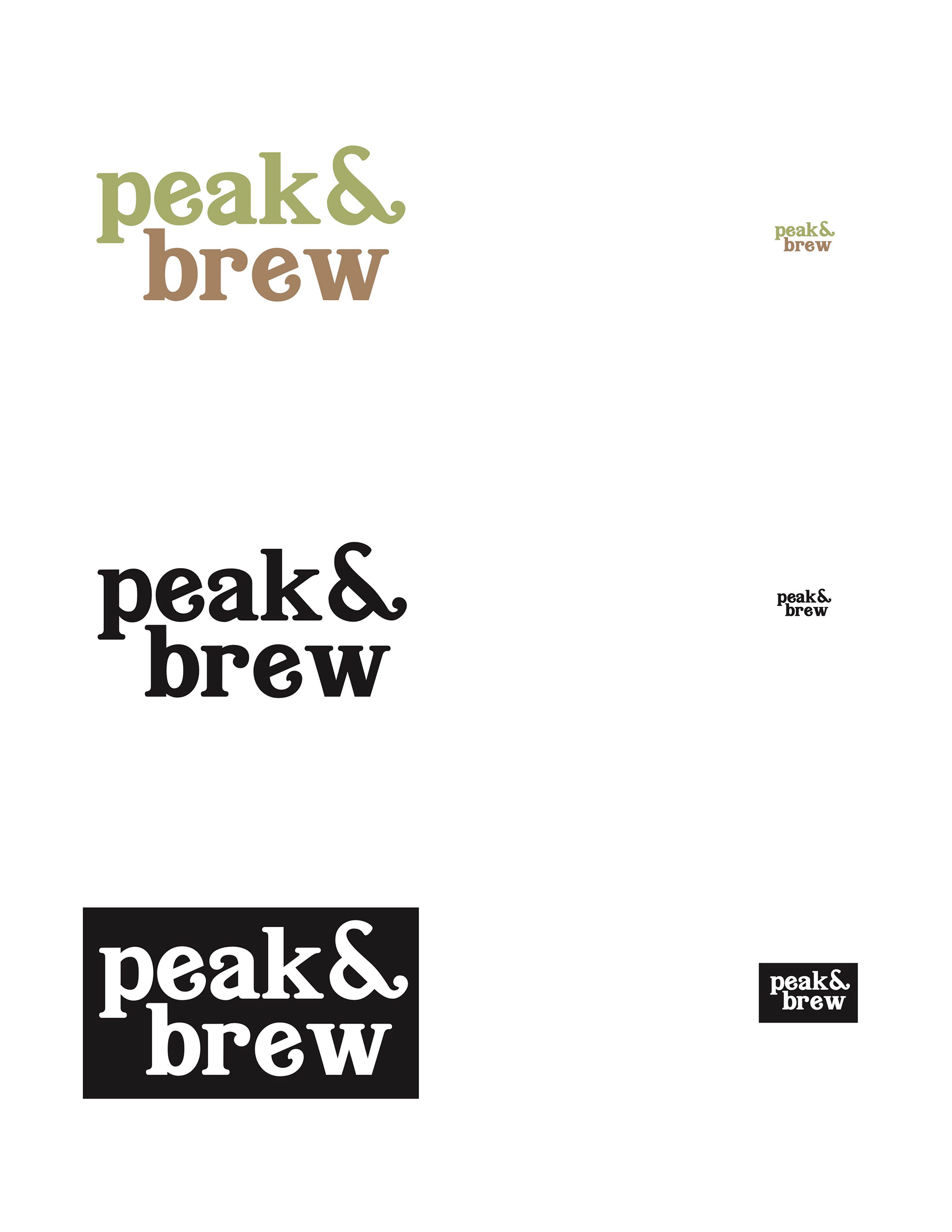
2nd Choice Logo
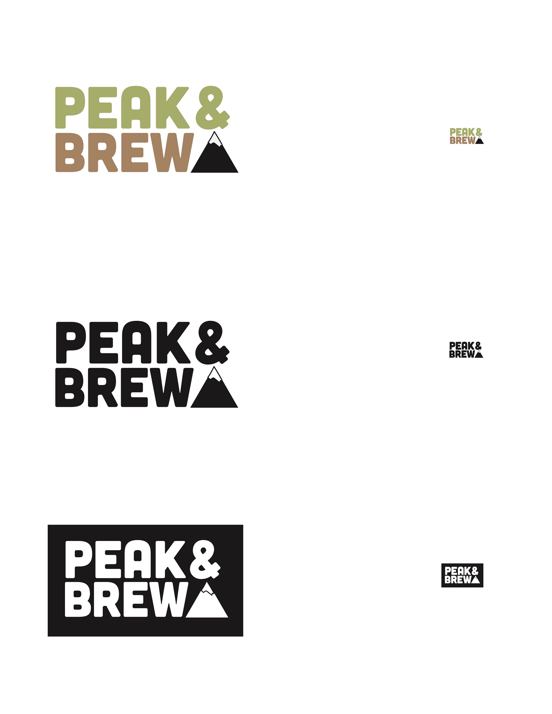
Final Choice Logo
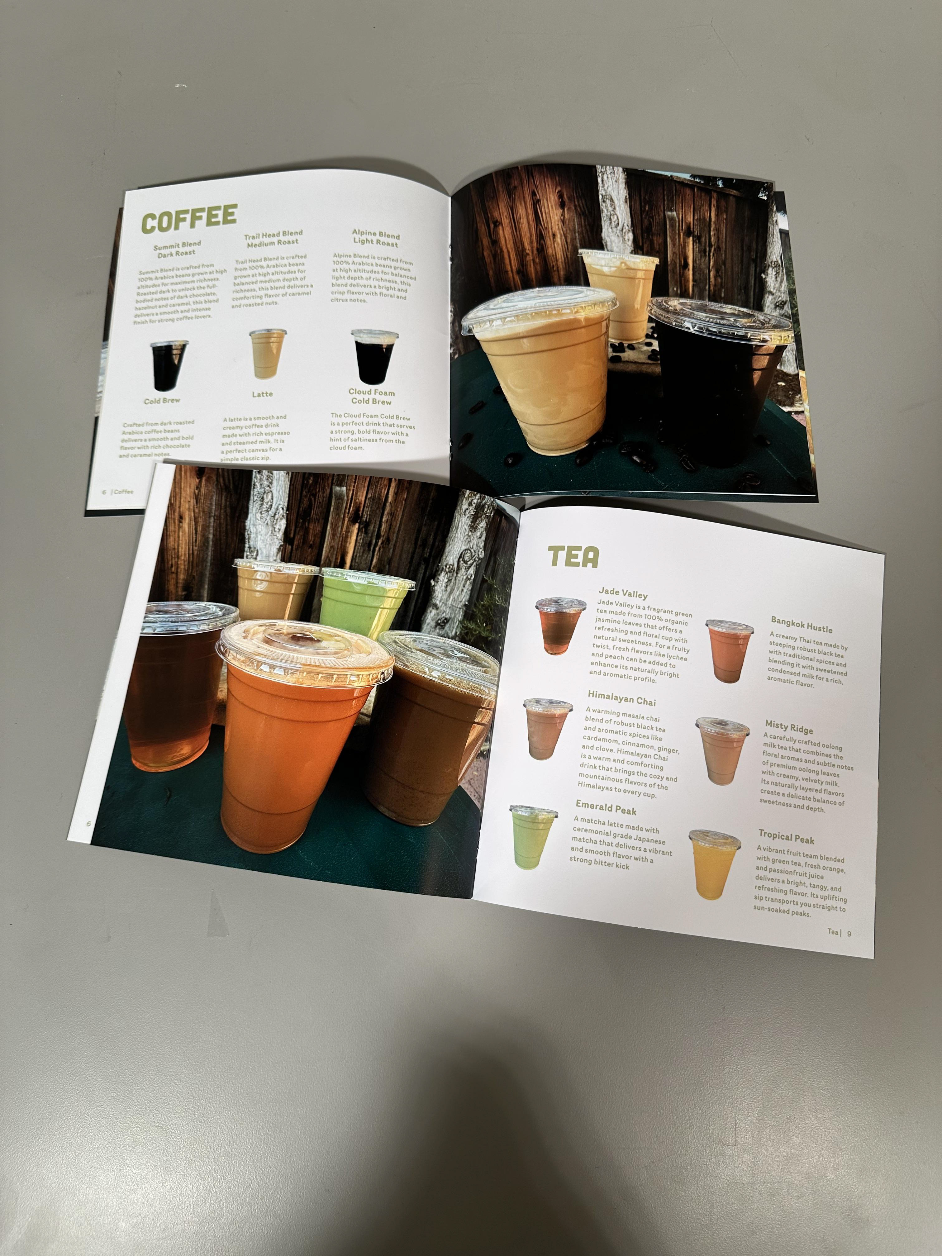
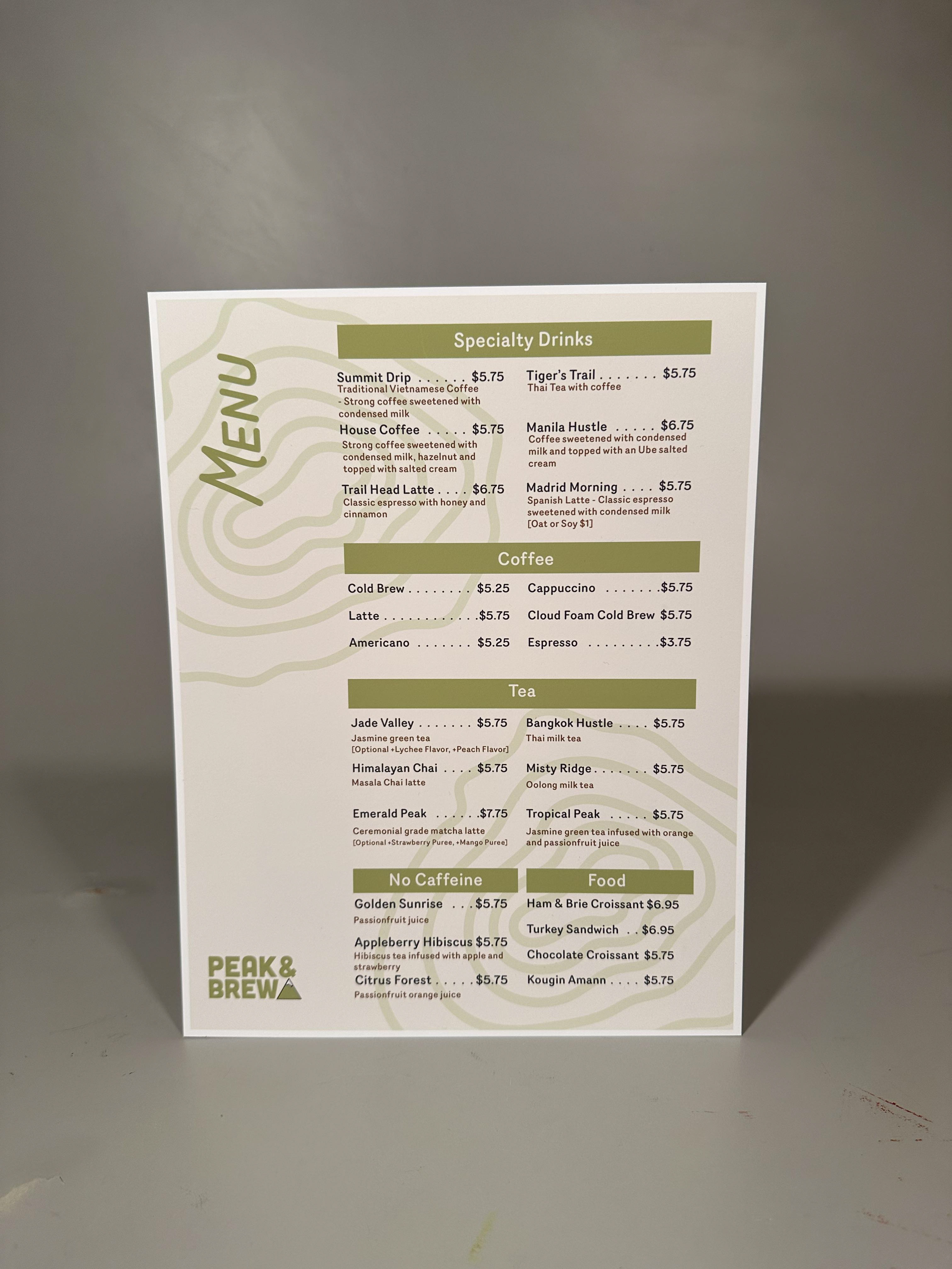
MENU DESIGN
I wanted to create a simple menu for customers.Based on my research, a lot of the cafe menus that caught my eye were split into different categories with a very short description next to it. Other menus only contained the drinks without any categories which I felt would be confusing for the customers. I split up the menu into five different categories, Specialty drinks, Coffee, Tea, Non-Caffeine, and Food. I also added descriptions of some drinks that explain the flavor.
The menu design was the project I spent the most time on. The first initial designs I felt something was missing and needed it to be more. The menu felt to bland to me. After making a lot of adjustments, the menu took me about a whole week to complete which I felt was more than I planned to.
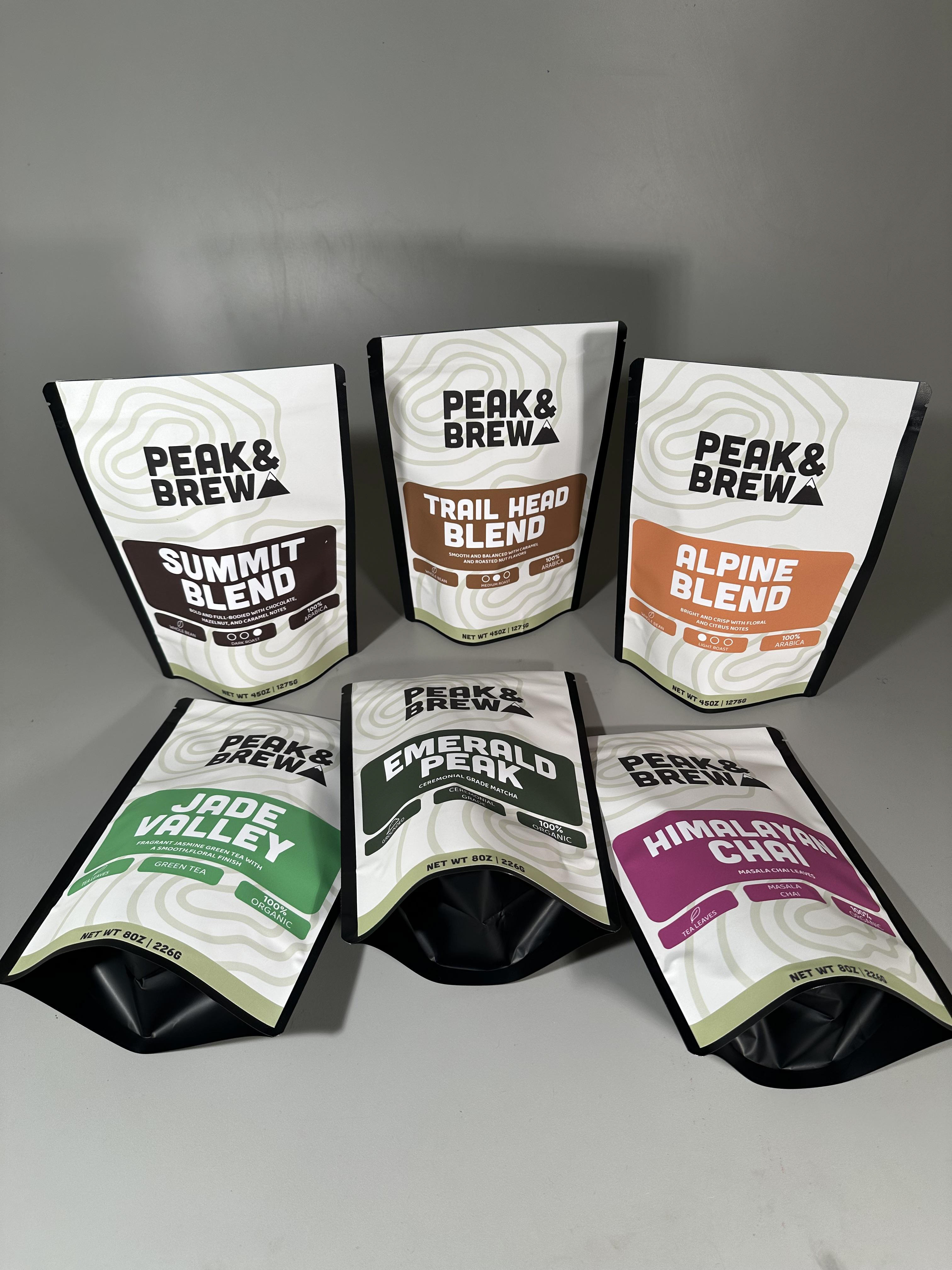
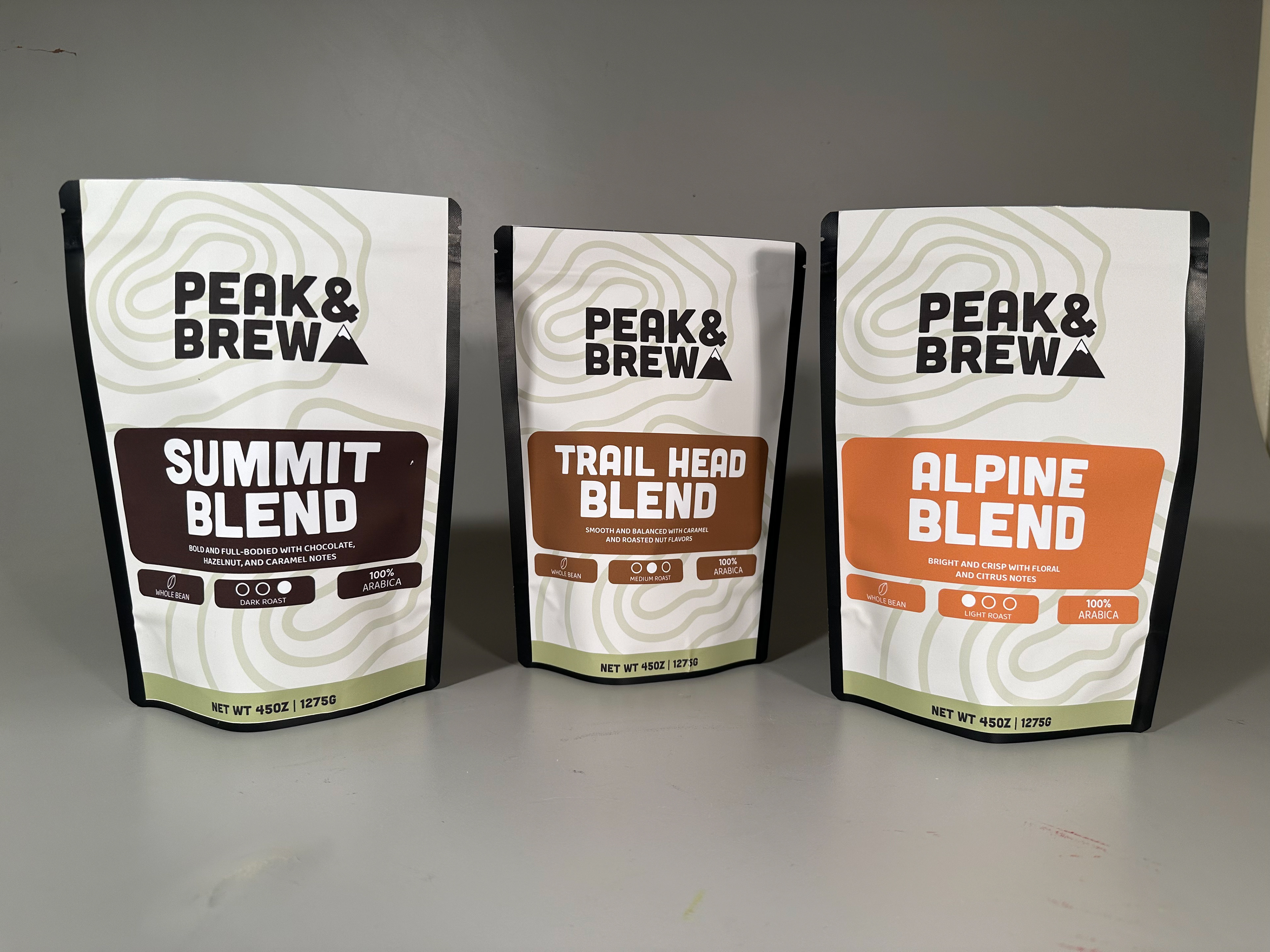
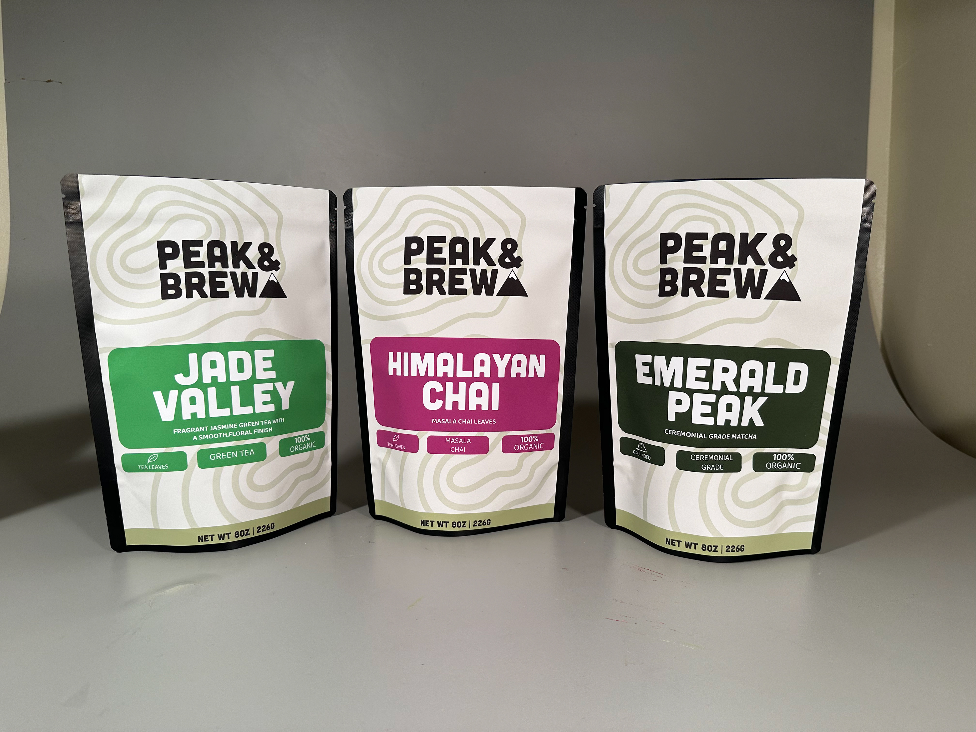
COFFEE & TEA PACKAGING
For the coffee and tea packaging, I wanted to create packaging that would be fun and bold. I started my process in Illustrator and started designing. Through my research with coffee packaging, they had the logo, coffee name, type of blend and a short description of the flavor of the coffee beans. A lot of the packaging had very small text. For my packaging, I wanted it to be a grab and go situation where customers can grab the item they want without any hassle of reading the small text in the package to find the right one. For the packaging, I incorporated bright colors for each type of coffee bean or tea. For example, the Emerald Peak matcha powder had a rich green color similar to the color of matcha.
After getting great feedback from my peers, I added a few things to the final packaging. I added the item name in the back so that the customer can recognize the item in case it was showing the back. I also made the brewing directions larger for legibility.
Making these coffee and tea packaging took a lot of trial and error. Due to budget problems, the vendor price was out of my budget so I resorted to my back up plan which was to print at the print lab and use the paper my professor could provide. I let my emotions not take over and did my best to create a package with the sources I was fortunate to be provided with. I used an adhesive matte vinyl and used the food storage packaging to put the adhesive vinyl on it.
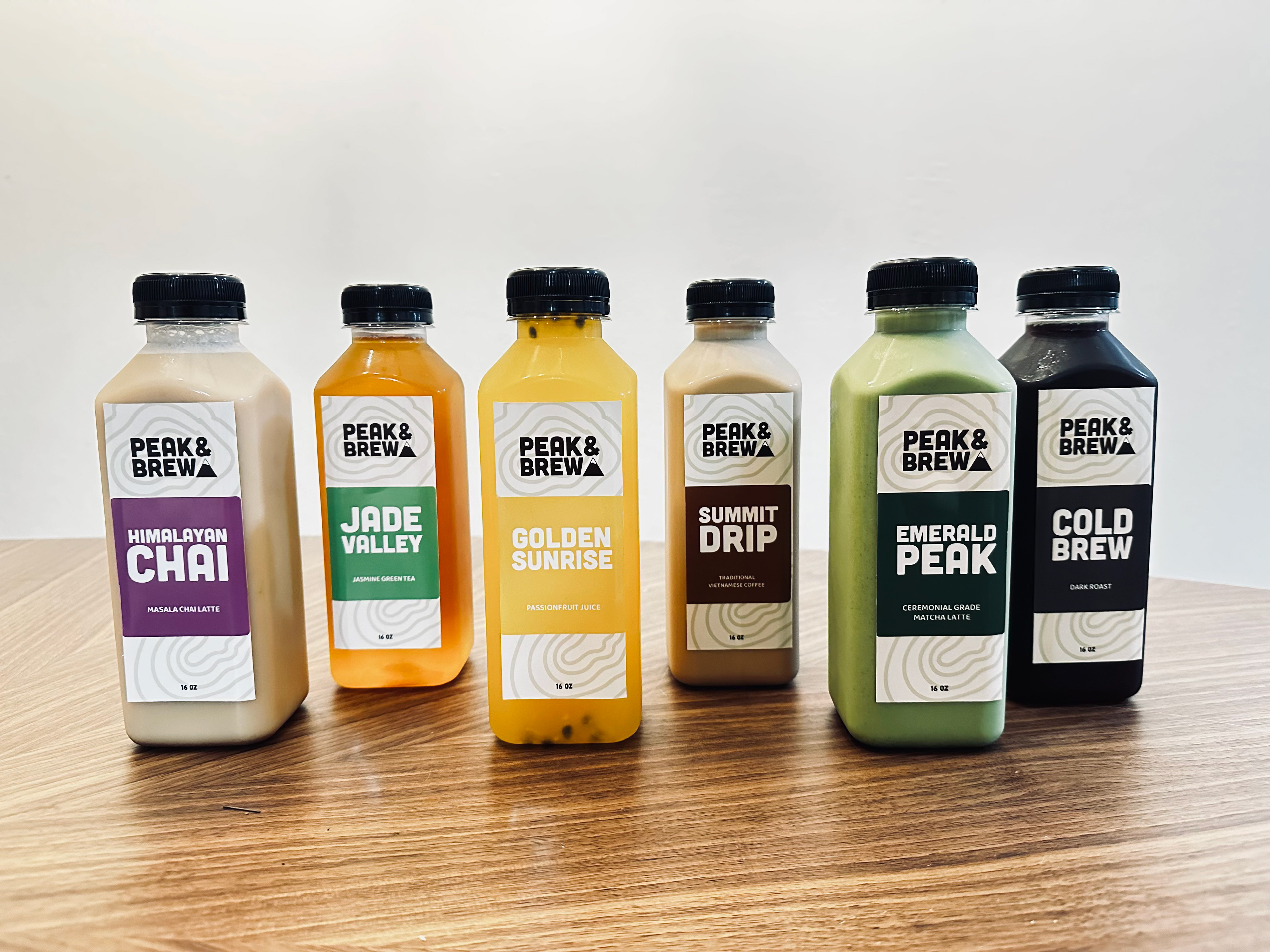
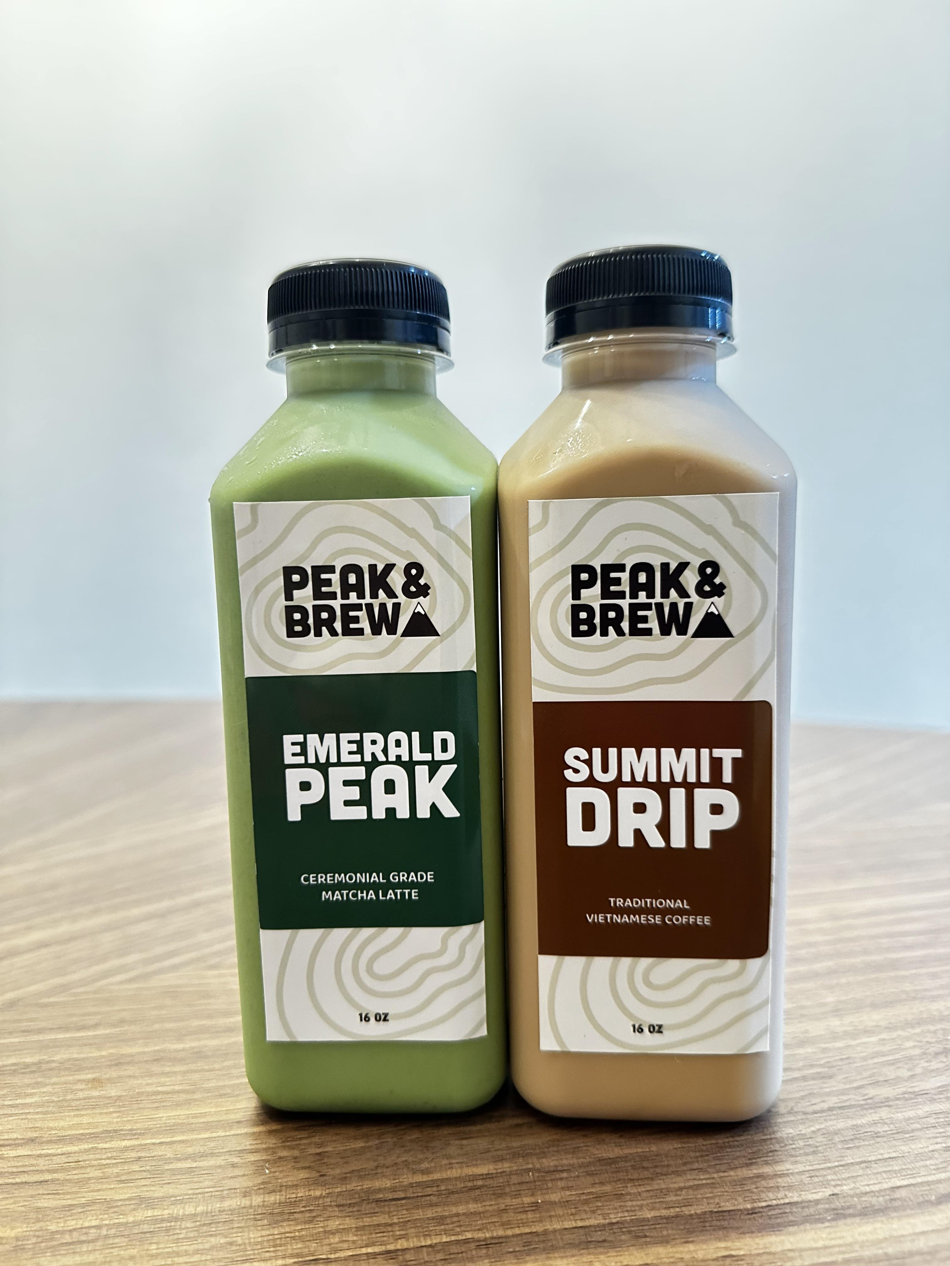
Bottle Packaging
After creating the coffee and tea packaging, I wanted to keep the design consistent with both of the packagings. I initially only created a front for the bottle designs because during my research the juice containers only had a front design. The front design contained the cafe logo, the name of the drink followed with a specific color, small text saying what the drink is and a best by area where the employees would write down the date the product is good to be consumed by.
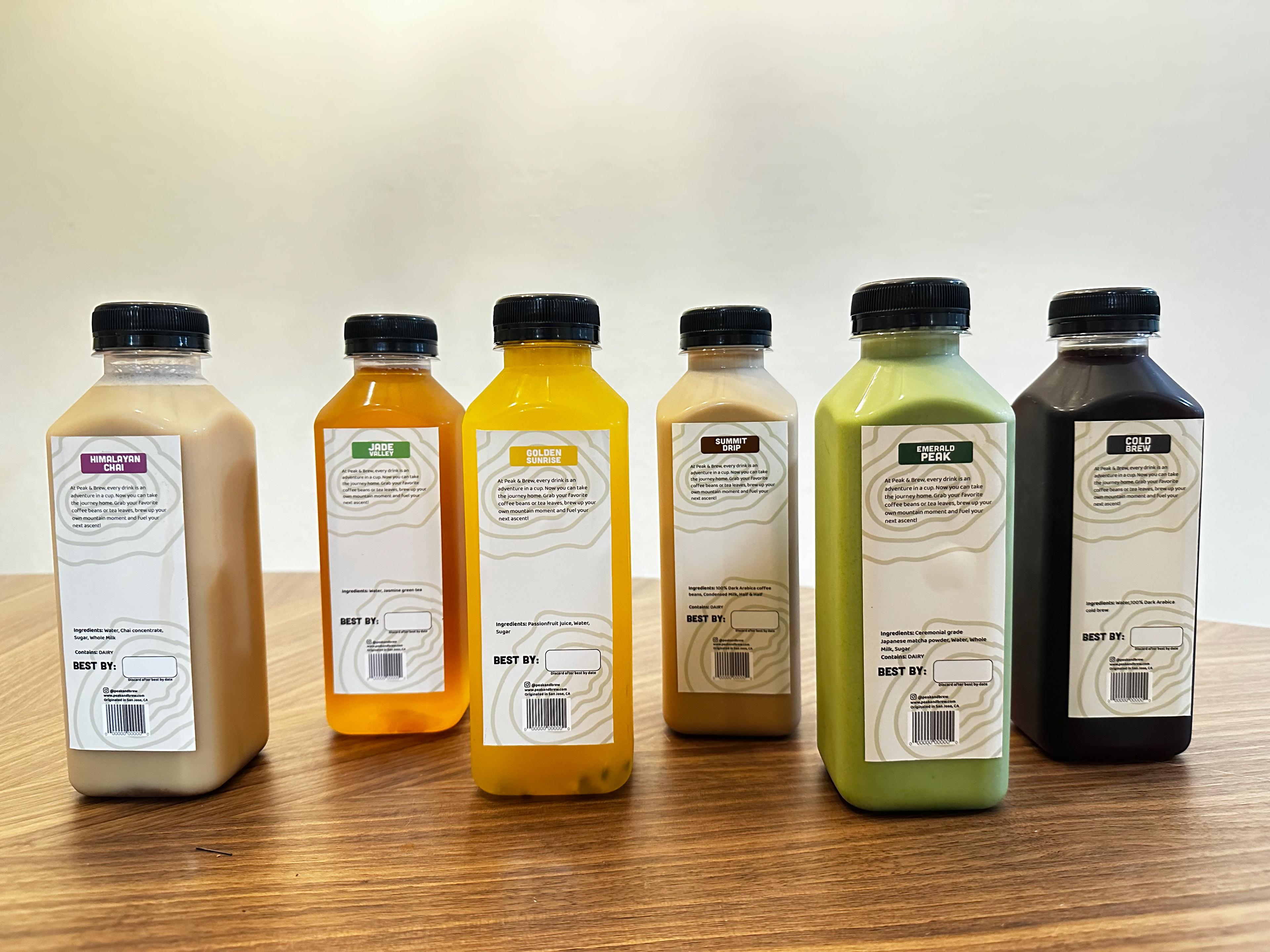
With the feedback I got during the critique, my professor and peers suggested to create a back cover since it felt too empty. I kept the design consistent like the coffee and tea packaging. I added the drink name, a description of Peak & Brew, social media information and a barcode.
Senior project was really a big step into how the real world would be. I taught me a lot on time management and that procrastination can come with consequences. Organization is another aspect I learned from senior project. I learned how layer on Adobe and creating sub folders on your computer can help with navigating through any early stages of the project to the final stages. One thing I would work on is communicating with my professor and peers. I feel like I got very little feedback on my projects because I didn’t communicate that much about it. Getting feedback would’ve helped with making improvements with my project to make them better.
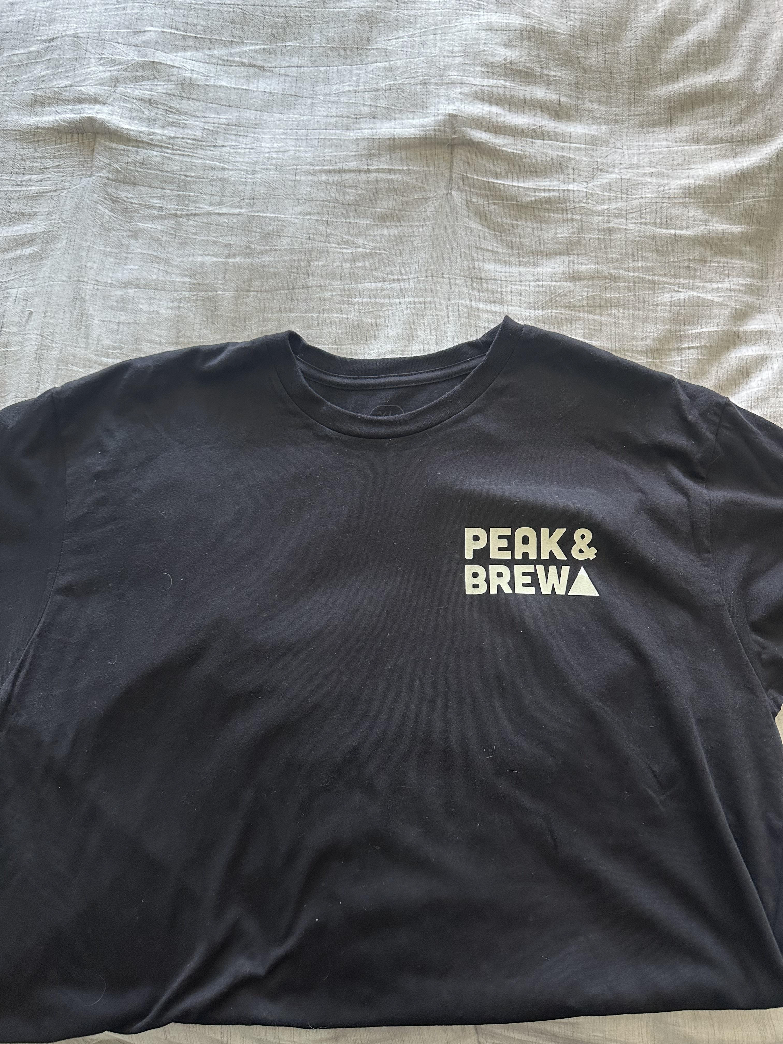
Front T-Shirt Design
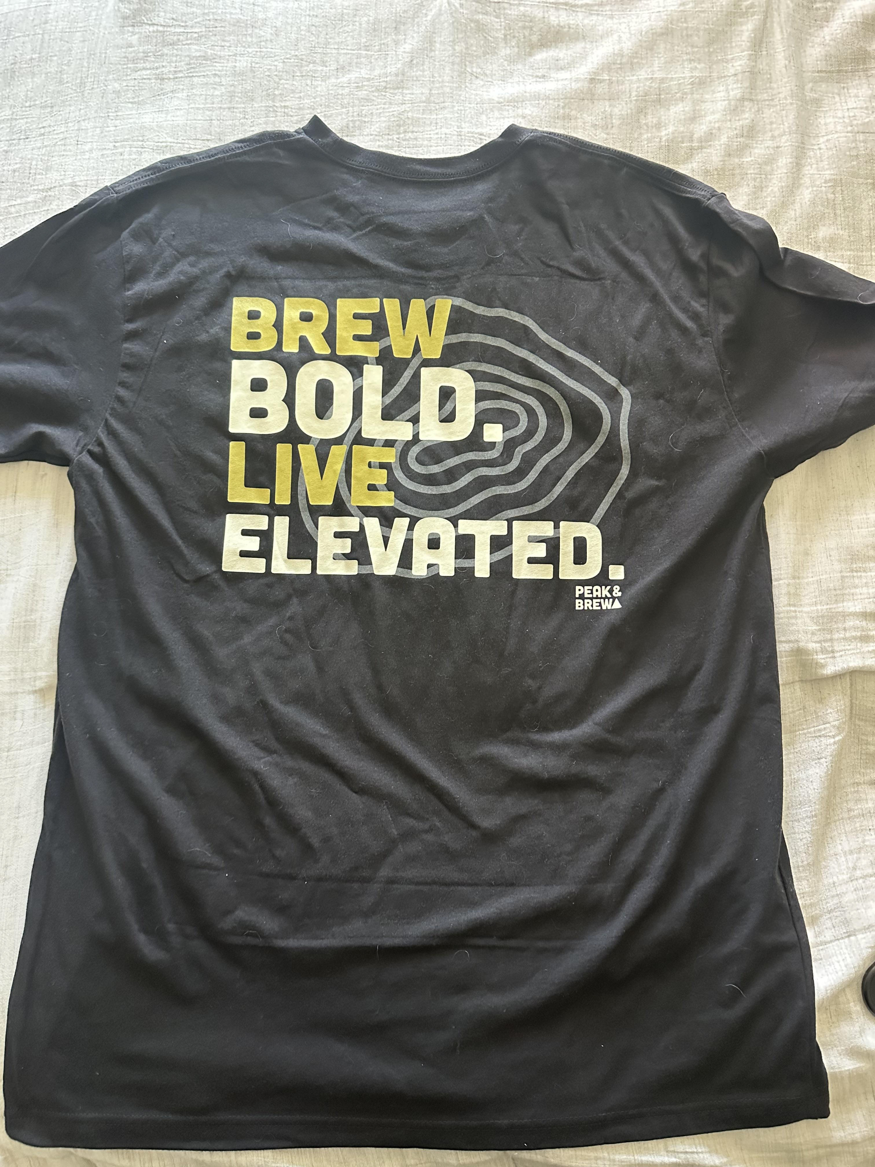
Back T-Shirt Design
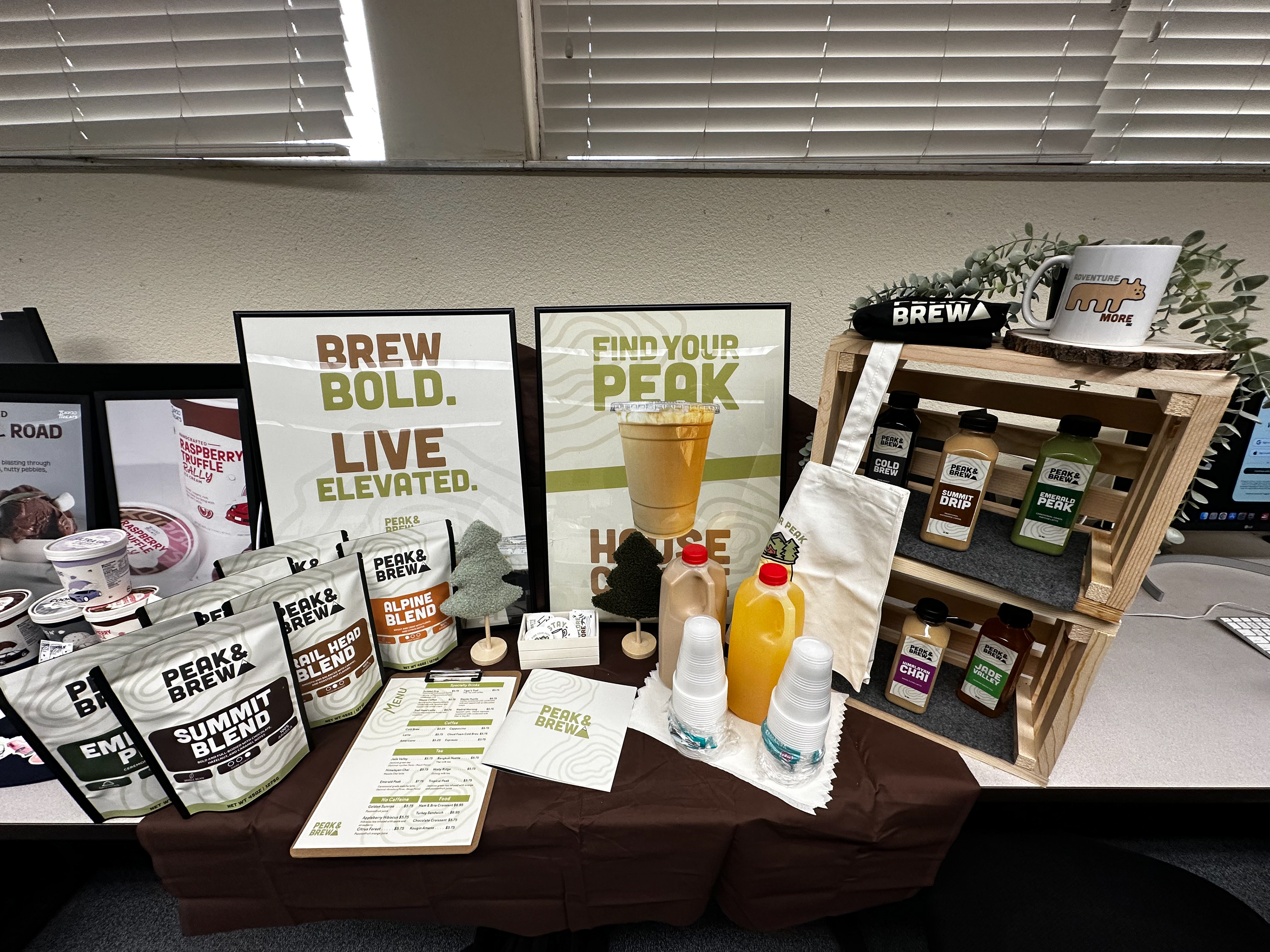
Final Presentation Setup
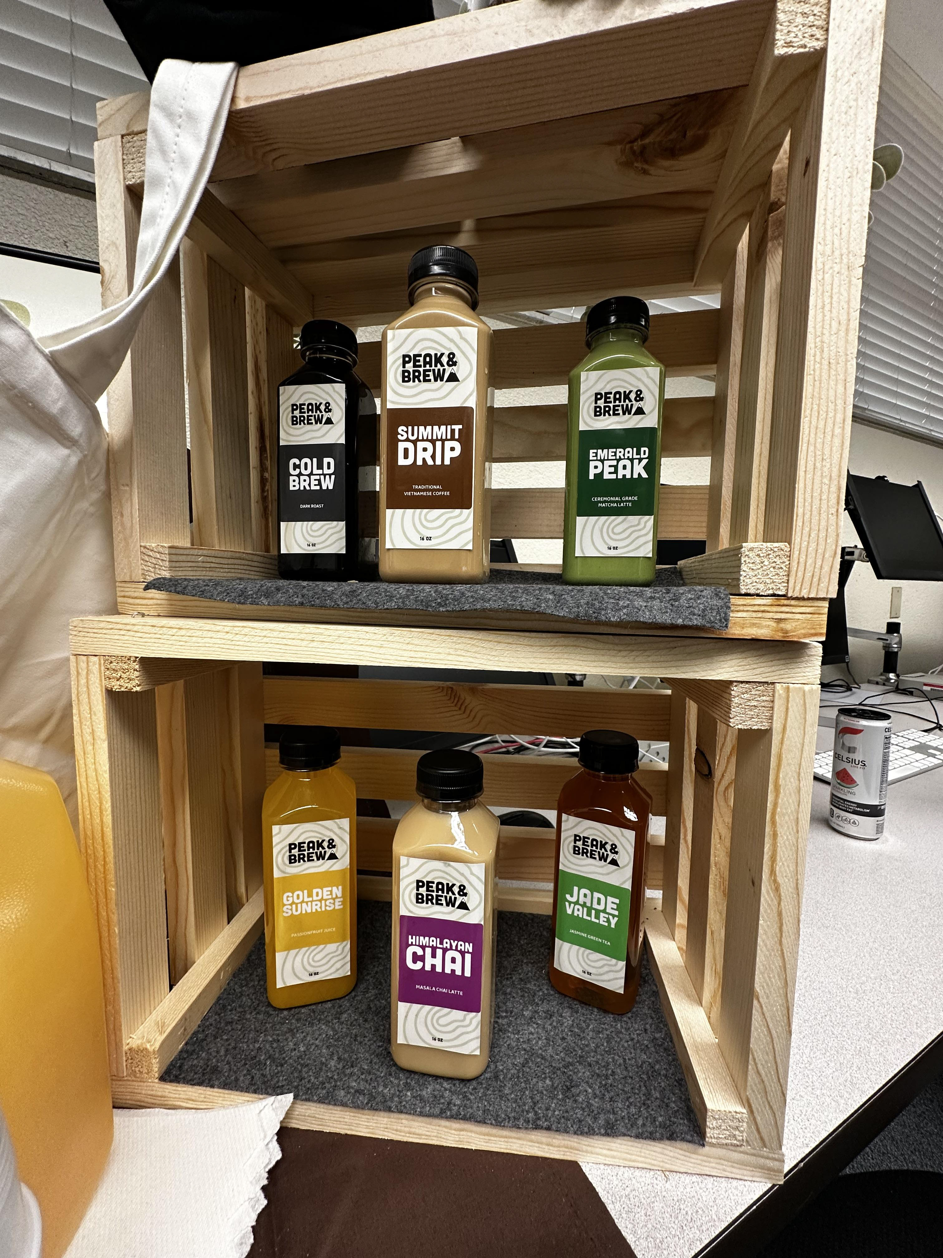
Final Presentation Setup - Bottle Designs
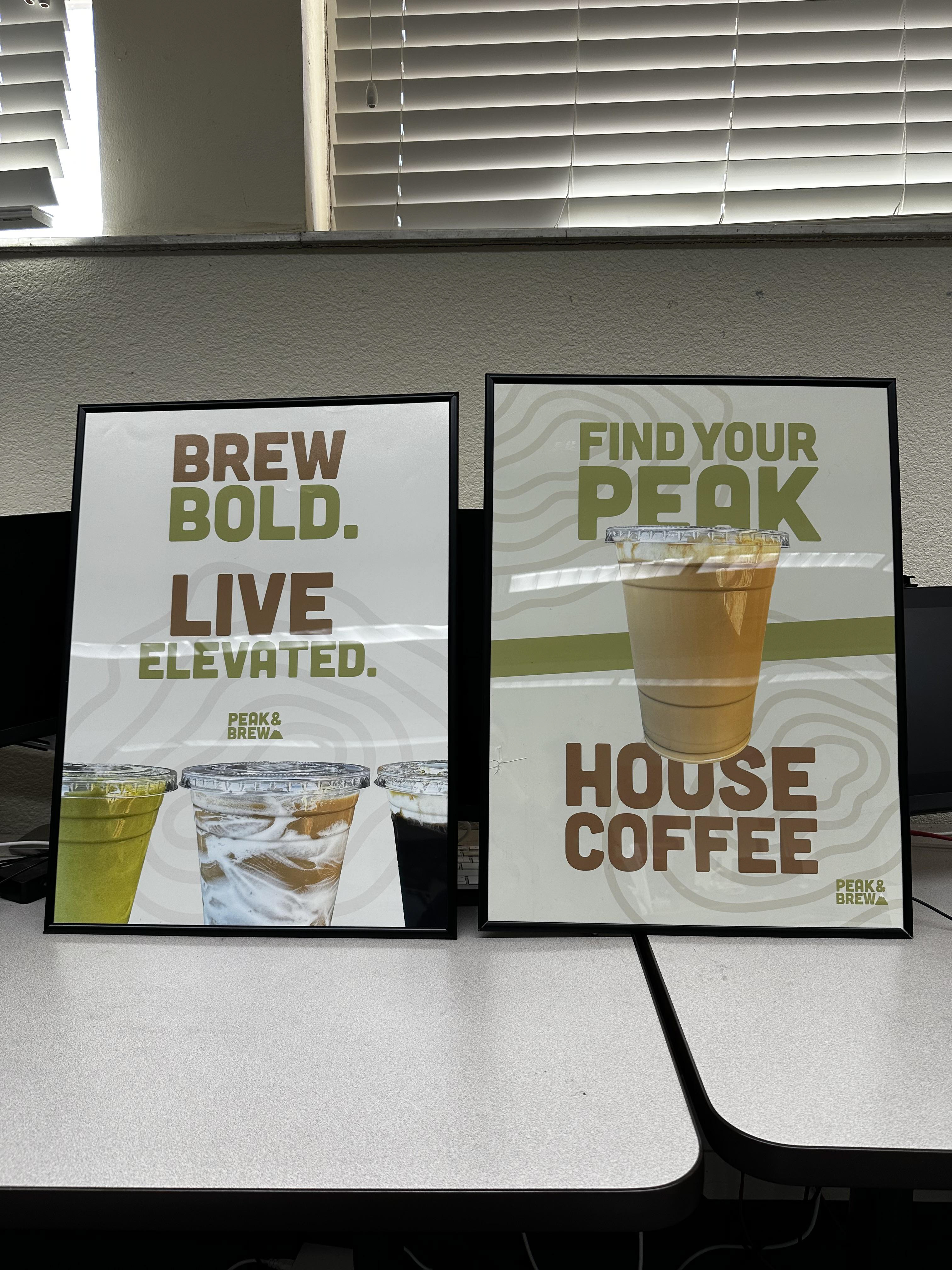
18x24" Promotional Posters
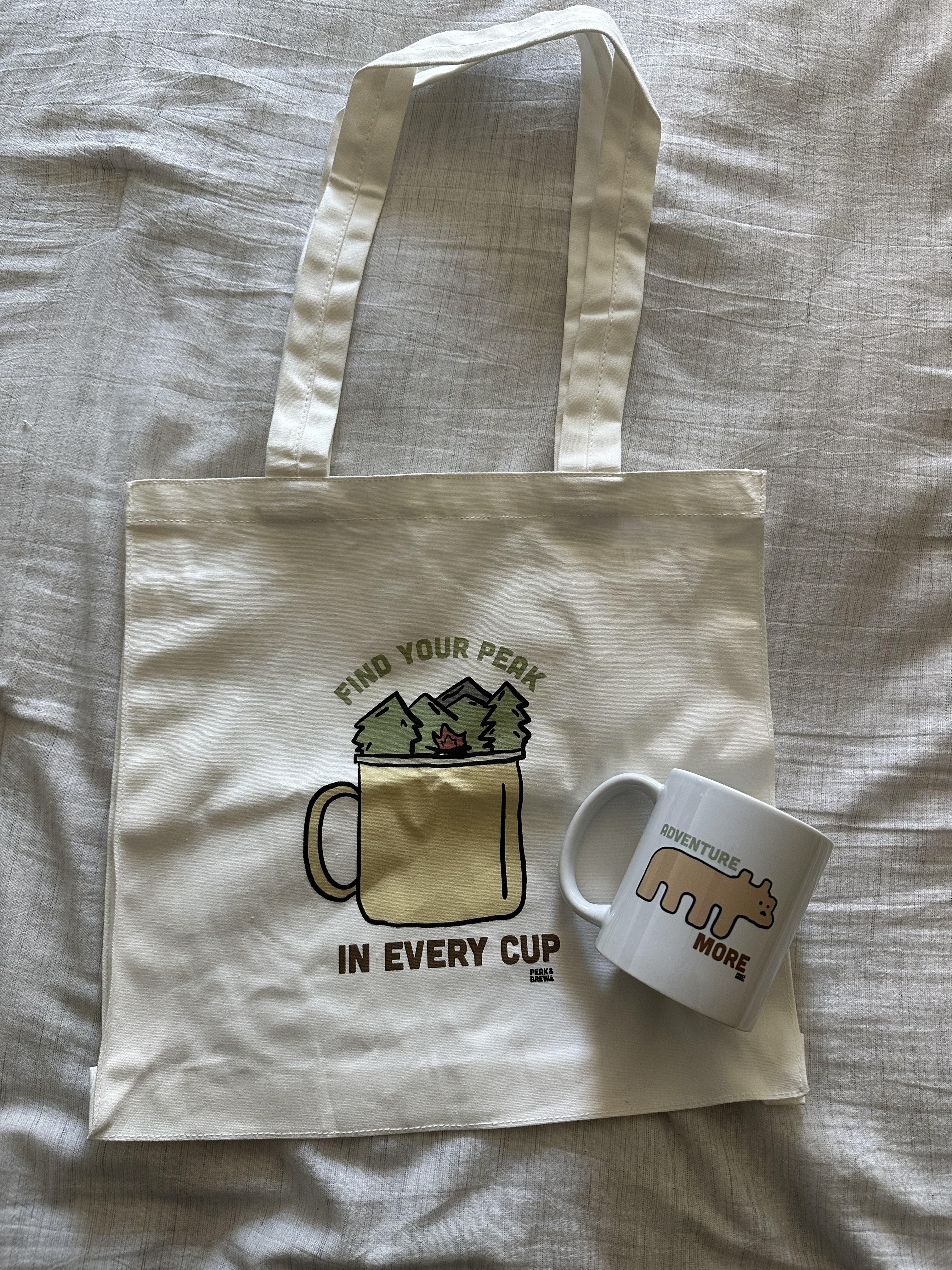
Tote Bag & Mug
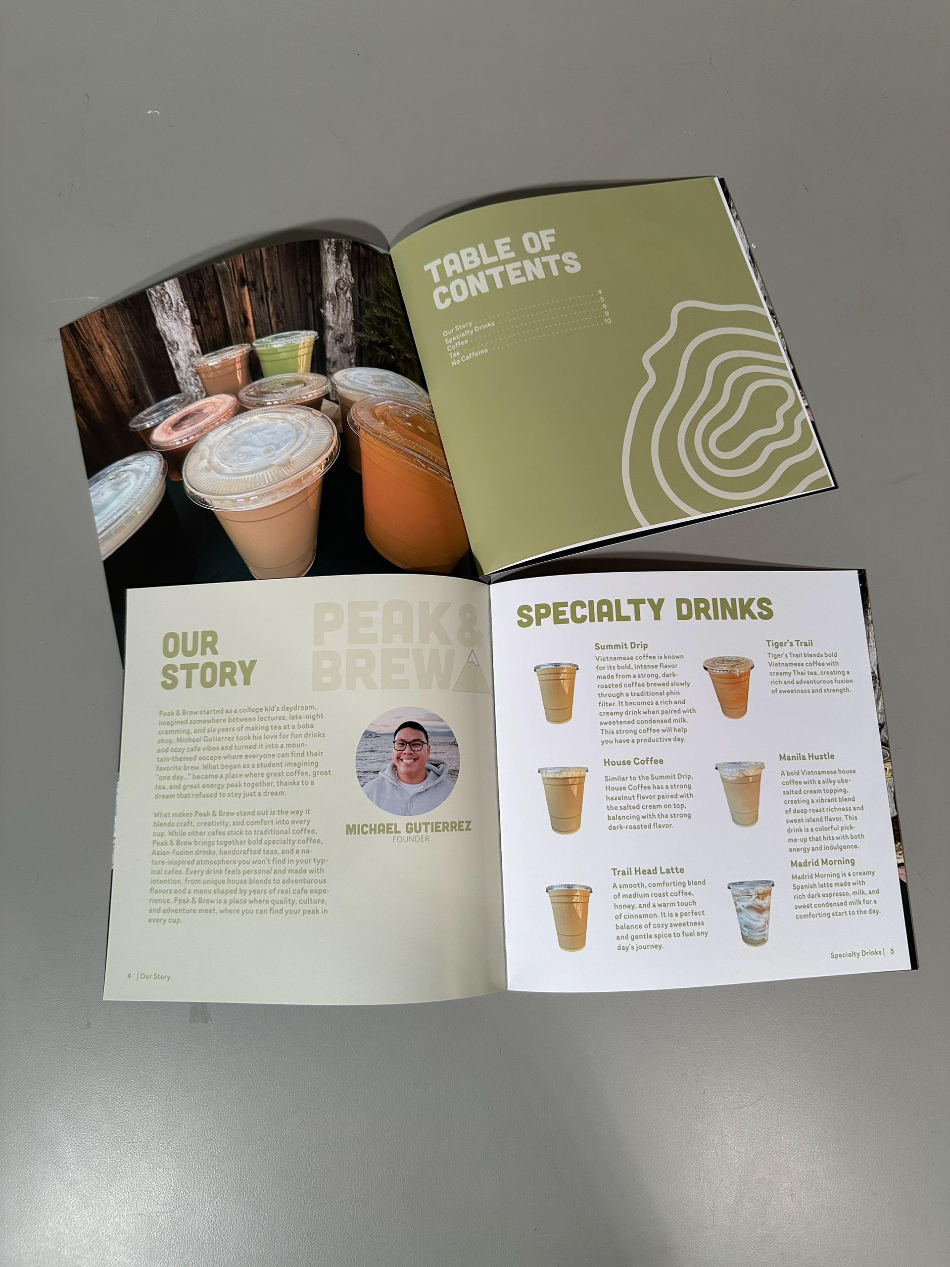
Lookbook